


Cape Cod Magazine
PURPOSE
This magazine was designed to showcase the beauty and tranquility of Cape Cod. I love to travel to Cape Cod every year and am inspired by the relaxing, picturesque beaches and nature. My goal was to create a magazine that illustrates the charm of Cape Cod and entice viewers to visit a few of my favorite places.
PROCESS
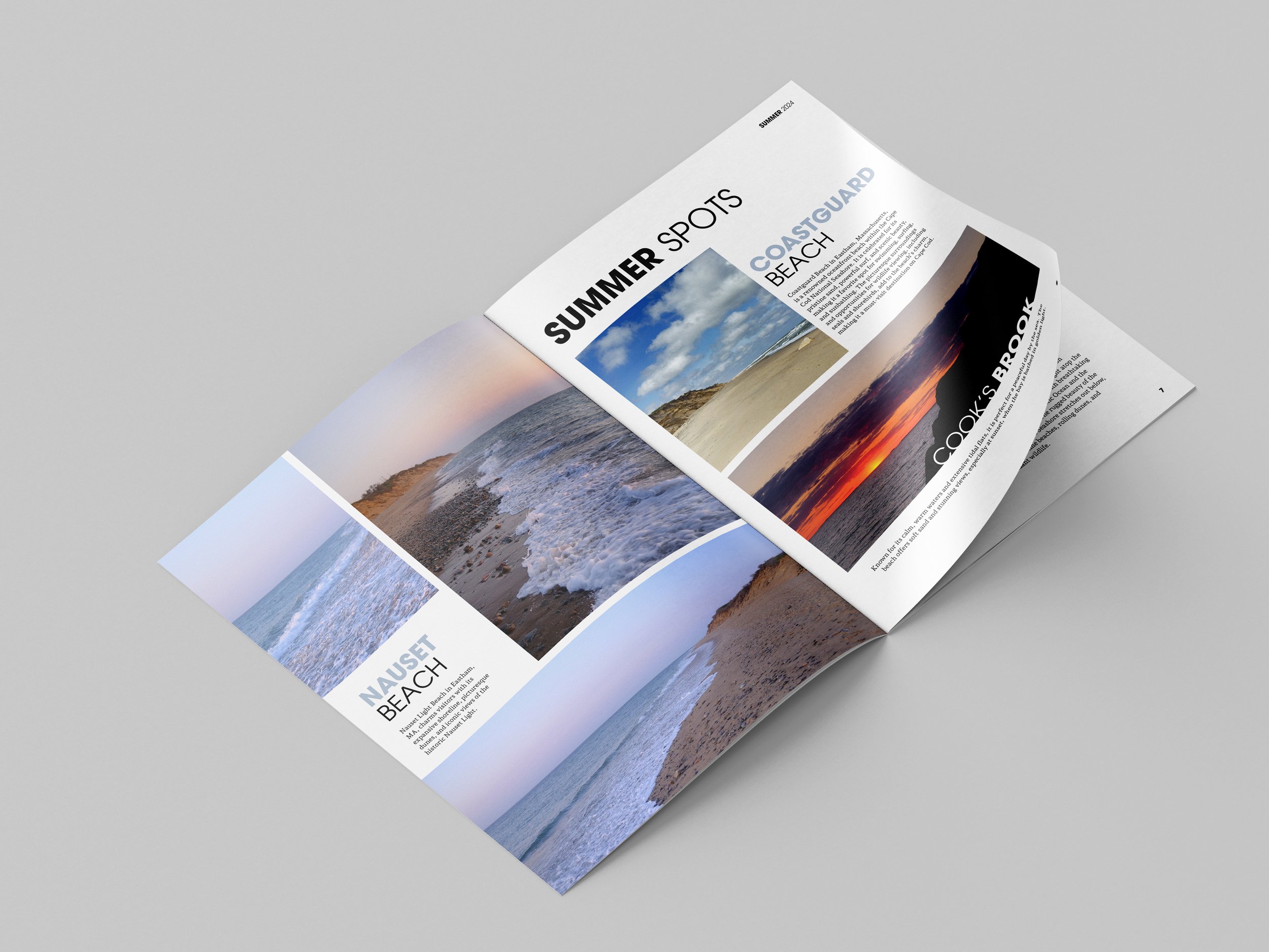
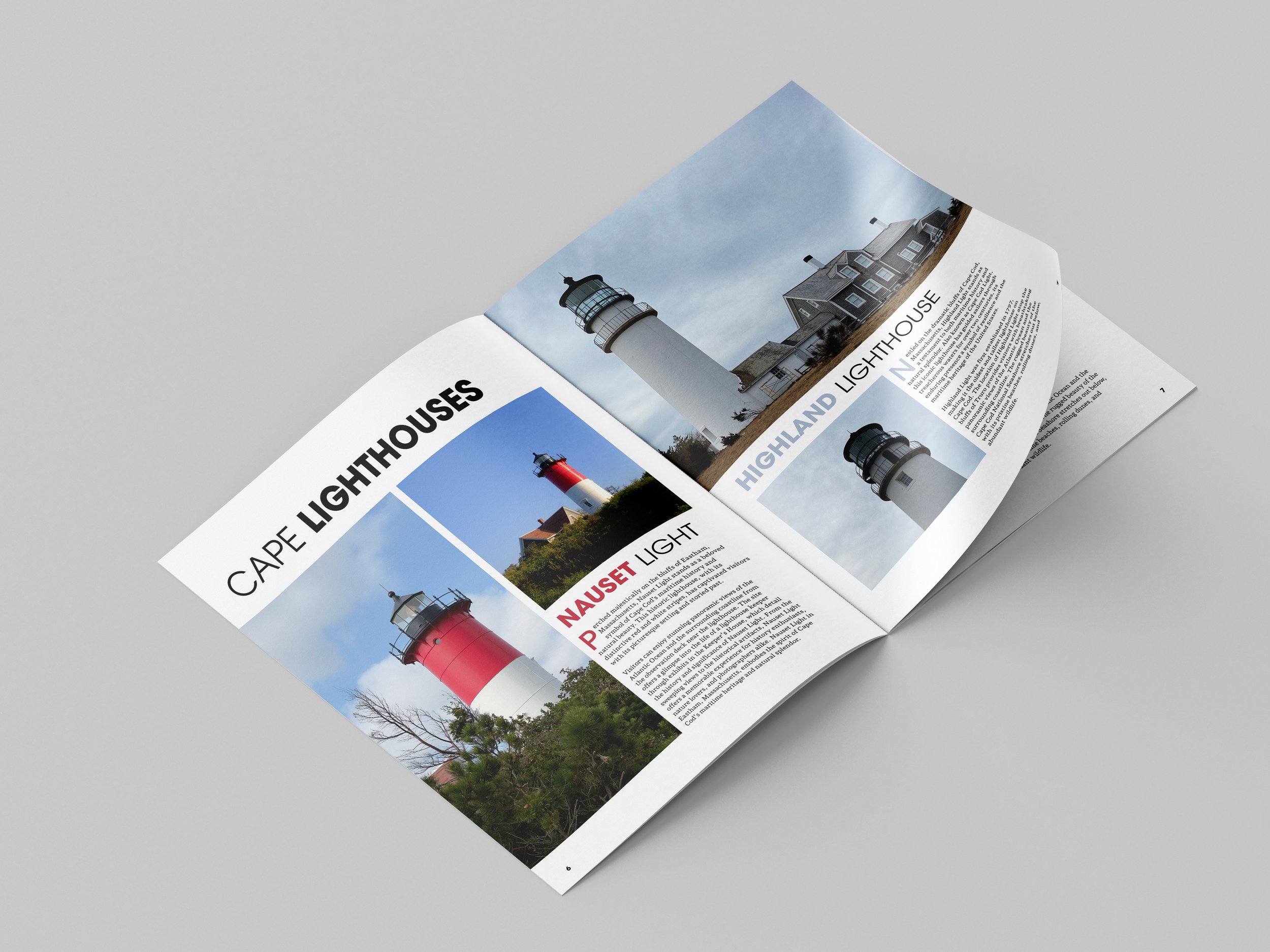
The sans-serif font for the title and headlines creates a bold, modern look, while the complimentary serif font for the body text is classic and easy-to-read. The photographs showcase the beautiful, dramatic colors of Cape Cod. The Nauset Beach page illustrates the dreamy, pastel colors after a sunrise. The Cook’s Brook photo highlights the stunning, intense colors of the sunset. The varying photograph sizes and crops help to create an engaging and bold spread. Close crops of the nature and lighthouses were chosen to show the beautiful details of each location.